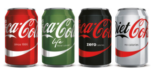
Say Goodbye to your old packaging of Coca-Cola because the Coca-Cola Company is now coming up with the makeover of their cans.
The world’s largest beverage maker which comes up with new ideas every time whether it is advertisements or flavors. This time the company has come up with a marketing strategy called “One Brand” packaging in which the company has decided four different colors for the four different flavors that is red for Coca-Cola Original (rendering the disc invisible), black for Coca-Cola Zero, gray for Diet Coca-Cola (or light, depending in which country you live) and Green for Coca-Cola Life respectively. The Red Disc is the “signature” element of the company’s new campaign that it’s using as a unifying color across the brand. Coca-Cola says the move will extend its “One Brand” global marketing strategy to its packaging.
The Atlanta Company says the “One Brand” look will roll out in Mexico in the first week of the next month. Similar versions of the Red Disc graphic will launch in additional markets around the world through this year and 2017.
James Sommerville, Coca-Cola’s VP of Global Design said: “The unification of the brands through design marks the first time in our 130-year history that the iconic Coca-Cola visual identity has been shared across products in such a prominent way. “Packaging is our most visible and valuable asset,” said Marcos de quinto, Coke’s Chief Marketing officer.
So, the next time you go for a can of Diet Coke, you might need to look twice to make sure you aren’t grabbing the full-calorie version.
Cheers!


Share Your Views